
In a fictional rebranding concept put together by Timothy Batzinger for UniWatch, the Detroit Lions have received an imaginative new look that combines both fresh elements and nods to the team’s rich history. While this rebrand is purely speculative, it offers a glimpse into what the Lions’ visual identity could potentially look like with a few exciting changes.
A Nod to the Past with Modern Touches
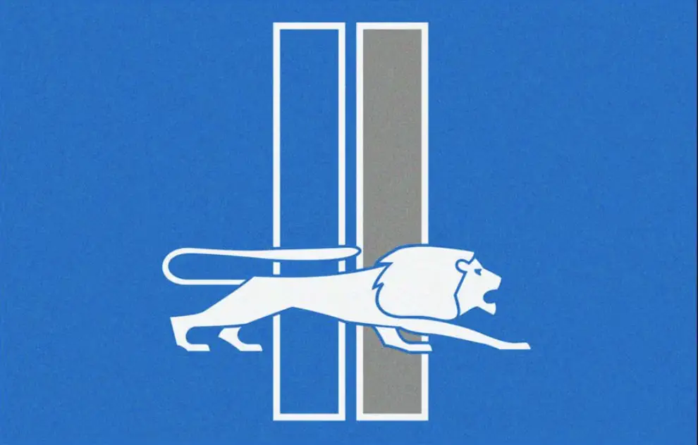
Batzinger’s redesign is heavily influenced by Detroit’s automotive legacy. The proposed new logo draws inspiration from automobile hood ornaments, creating a sleek and modern feel while staying true to the team’s roots. A newly designed lion head logo pays tribute to the team’s original branding, while incorporating racing stripes—a feature reminiscent of the ’60s and the Lions’ short-lived blue alternate helmet.
Additionally, a secondary logo showcases the silhouette of a lion over the letter “D,” with stripes added to convey motion and speed, reflecting Detroit’s connection to progress and innovation. A particularly interesting addition is a proposed perma-memorial for William Clay Ford, the team’s late owner, which includes his initials “WCF” stacked alongside a lion, integrated into the letter “D”—a respectful tribute to his contribution to the franchise.

Uniform Changes: Traditional Yet Fresh
When it comes to the uniforms, Batzinger has aimed for simplicity and tradition, while introducing some fresh ideas. The uniforms carry forward the racing stripes theme from the redesigned logos, making them a natural extension of the new look. The numbers also feature a beveled design, giving the jerseys a more modern, sharp aesthetic. In a particularly eye-catching move, the perma-memorial for William Clay Ford would be proudly displayed on the left chest, keeping his legacy a central part of the design.
One of the most notable suggestions in the rebrand is the return of red jerseys, which have been absent from the Lions’ regular uniform rotation since 1955. While the red jerseys have historically been part of the team’s identity, this new look brings them back as a fresh alternate option for the Lions, offering fans a new way to express their team pride.

A Historical Homage with a Modern Twist
Batzinger’s concept also reintroduces a throwback design inspired by the 1953 Lions’ third NFL Championship victory, a season that marked the first time the team wore a uniform different from their traditional grey and blue. By bringing this design back, the rebrand connects the team’s past with its future, giving fans a stylish and historic alternate look.
A Future-Oriented Brand with Deep Roots
This proposed rebranding doesn’t mean the Lions are actually changing their identity, but it offers an intriguing vision of how the team could look if they embraced a mix of tradition and modernity. With racing stripes, updated logos, and the return of red jerseys, the concept highlights Detroit’s connection to its rich history while positioning the franchise for future success. The introduction of the throwback 1953 design adds a nostalgic touch, celebrating the Lions’ championship past.
Though this is merely a fictional rebrand, Batzinger’s vision creates an exciting opportunity for the team to refresh their identity while maintaining their deep-rooted connection to the city of Detroit. Whether it’s the return of red or the modernized logos, it’s a reimagining of what could be for the Lions’ visual future.

Recent Comments